Every brand reaches a moment where what the world sees no longer matches what it has already become.
Not suddenly.
Not through a single decision.
But quietly, over time.
The way it thinks changes.
The way it operates changes.
The problems it solves become bigger.
The expectations become higher.
And eventually, the identity built for yesterday can no longer represent where the organization is headed next.
That was the moment AnnexMed arrived at.
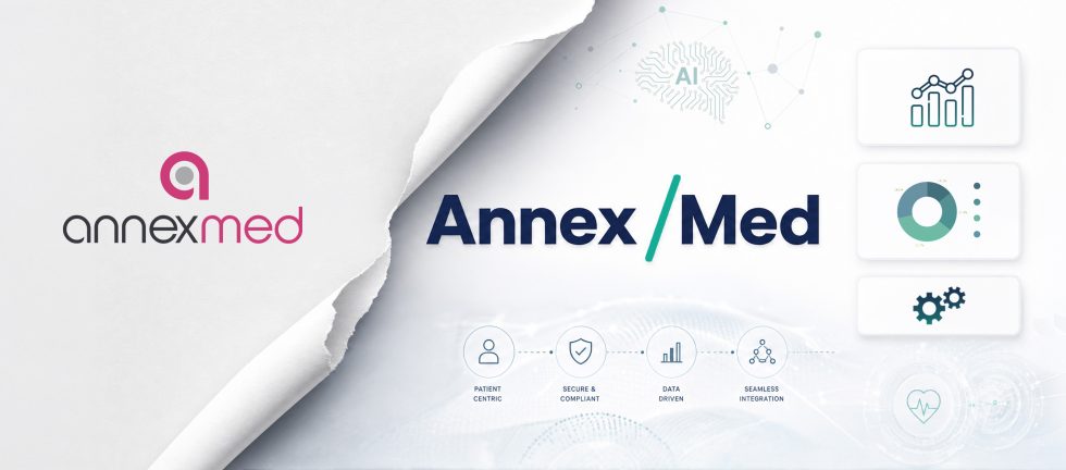
New Purpose and Branding: The Thinking Behind the “/”
“As AI adoption grows across the healthcare industry, AnnexMed has been building toward that future and the new identity reflects that progression.”
For years the brand reflected an organization rooted in digital healthcare operations, structured, process-driven and built around reliable service delivery.
That organization still exists at the core. What surrounds it today is sharper, more connected and built for a healthcare industry that runs on intelligence, automation and integrated workflows. The new identity carries all of that forward.
The centerpiece of the new look is the “/”. It was not a casual design choice. It sits at the center of the logo because it carries the most meaning of anything in the identity.
The slash represents forward motion, connection, intelligence and momentum. More specifically it captures the intersection where:
- Healthcare meets innovation
- Human expertise meets AI-enabled intelligence
- Operational support grows into strategic partnership
The forward leaning angle was intentional too. It communicates a brand that is continuously moving ahead rather than standing still.

Beyond the symbolism the “/” also functions as a bridge across everything AnnexMed does. Connecting systems, integrating technology and enabling smarter outcomes across the healthcare ecosystem. As AnnexMed continues building on automation, analytics and AI-enabled workflows, the new identity captures where that journey has brought us and where it is heading next.
Where AnnexMed Is Today
The rebrand reflects a very real transition. From a traditional healthcare service provider to a future-ready operations partner that brings both expertise and intelligence to the table. That shift didn’t happen overnight. It was built steadily through the work, the capabilities and the direction the team has been moving in for years.
The new logo represents intelligent transformation, connected healthcare operations and a technology-enabled vision designed to grow with the organizations we work with. Precision and agility are baked into that thinking too, not just as values but as the actual way we operate.
What stays unchanged through all of this is the purpose. Delivering reliable, outcome-driven healthcare solutions has always been at the center of what AnnexMed does. The rebrand just makes that clearer.
Why This Matters
A rebrand at this point in AnnexMed’s journey is about communicating clearly to healthcare organizations, partners and the broader market that we have grown into something bigger. The updated identity also aligns with how AnnexMed is positioning itself across global markets, where the demand for intelligent, connected healthcare operations is only growing.
The “/” will mean different things at first glance. But for the team behind it, it means one thing clearly. AnnexMed is moving forward and building healthcare operations that are smarter, more integrated and genuinely built for what comes next.
AI-Enabled. Human-Led.